Focusing on these design areas could help propel your campaign to victory
We’ve all seen ads that make us stop scrolling. Maybe they make us turn up the sound on our phone or stop walking to take in their message.
Tight budgets, quick turnaround times, and scattered resources can make it harder for political campaigns to capitalize on good design. However, good design has engaged, motivated, and incentivized buyers in the corporate world, and we believe there are important areas that political campaigns can learn from to maximize the impact of their ads. As one of COMPETE’s core Motion Designers and a current Grad student at Savannah College of Art and Design – Atlanta, I’ve spent a lot of time analyzing and researching corporate trends to understand best use cases in political design. I’m actually writing an entire thesis about it for my Master’s degree, with a focus on motion design in political campaigning (circle back with me in November to see the final!).
In this newsletter, I want to share some of what I’ve learned to help you campaigns better harness corporate brand tactics to win votes. Here are three areas corporations capitalize on, that you might be missing out on in your campaign.
1. Your Brand Matters
Logo design is one of the first elements that identifies a brand in its simplest form, and chances are you recognize logos subconsciously every single day. Google. Starbucks. Netflix. In 1995, Marketing Week found that the McDonald’s logo was more recognized than the Christian cross.

This recognition is important: Various studies in the corporate world have found that brand recognition pays dividends when it comes to brand positivity and it has been associated with increased customer loyalty and brand trust. These studies also found that the repetition of the brand name in positive messaging through various channels will reinforce a positive relationship between consumer and client. (You can find these studies here and here).
We’ve seen good branding in the political arena. AOC created a brand so engaging it encouraged groups historically left out of the voting process to get out the vote and help her beat incumbent Joe Crowley.
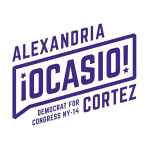
It even spawned AOC copycats everywhere. More so, the AOC tilt became a progressive symbol in and of itself. Her design highlighted the importance of clean, clear, and purposeful branding.
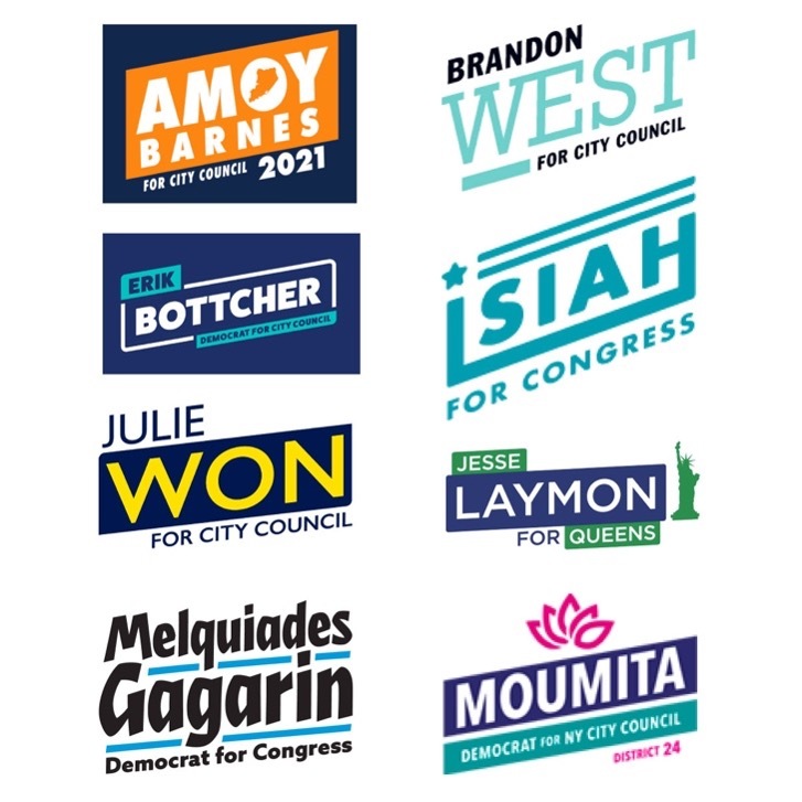
Name recognition is so important in down-ballot races. Creating a compelling and memorable logo and brand could be the competitive edge you need to push your race to a win. Through my research, I’ve learned that crafting a brand identity is much more than a stylish way of combining names and races – it’s an important opportunity to connect with your community. In gathering messaging intel, you can also use this data to engage your voting constituents. That simple upside exclamation mark on AOC’s logo? Although it may seem simple or like an afterthought, it’s one of the most important elements of that logo. It was a recognizable way to signal to Spanish-speaking voters that she was with them, enveloping them in a process they often felt left out of.
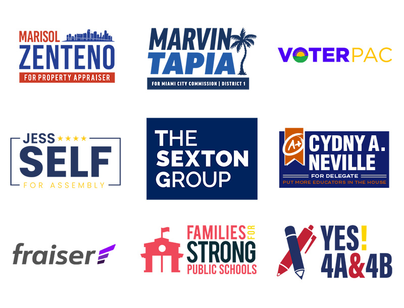
Below is a snapshot of some of our logo branding work. Get in touch with us to see how we can create meaningful brand identities that align with your voters.
2. Video and Motion Design Are Non-Negotiable Ingredients to Success
You may have read about TikTok in our April 2024 newsletter. Between Tiktok, Instagram and Facebook reels, and Youtube and CTV ads, video and motion design is everywhere. Many people – voters – interact with video regularly. It is becoming ever more important to utilize purposeful video content in your campaigning.
There’s interesting motion work going on in the corporate field. Corporations have started to think critically about how their messaging and brand can stay consistent across platforms, including how their brands develop in video. One of the leading branding and design studios, Tröllback + Company, develops motion branding for companies. Their work on ABC’s rebrand sets the standard for motion design in the entertainment industry. In developing ABC’s rebrand, Tröllback asked how they could create a motion system that was recognizable and consistent across television, social media, and advertising. Just like a logo, how text and elements animate can create brand awareness and value for customers.
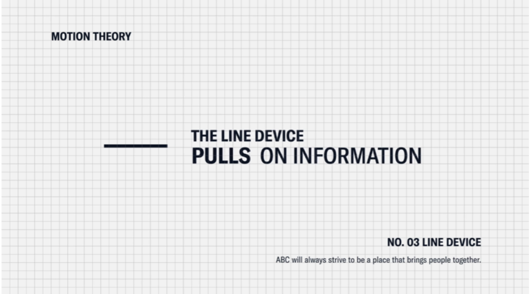
Campaigns have started hiring social media and motion designers for this very reason. Digital natives, or people who have grown up with access to digital information and technologies, make up a large section of the voting conglomerate – including nearly 41 million Gen-Zers who will be eligible to vote in November. If you’re not developing good video content for your campaign, you might be missing critical voters.
Did you know that COMPETE optimizes video content for three different sizes? By versioning our videos out in vertical, horizontal, and square format we make sure that our video content has maximal reach on digital platforms, reaching those crucial voters where they’re at. See how I repurposed this scene for Sonny Dhaliwal’s winning campaign in three different ways.

Furthermore, in this video campaign, I used consistent motion language to highlight his key points. This consistency is the same type of branding we’re seeing in the corporate world.
Want to see more of our work? Check out this highlight reel we launched earlier this year.
3. Streamline Your UX and Web Design Experience to Generate More Clicks
User experience, or UX, is the process through which users (ahem, voters) navigate through your content. This can mean scrolling through your website or even routing to your ActBlue donation page.
User experience design can easily be overlooked or misunderstood, but corporations have departments dedicated to this specialty.
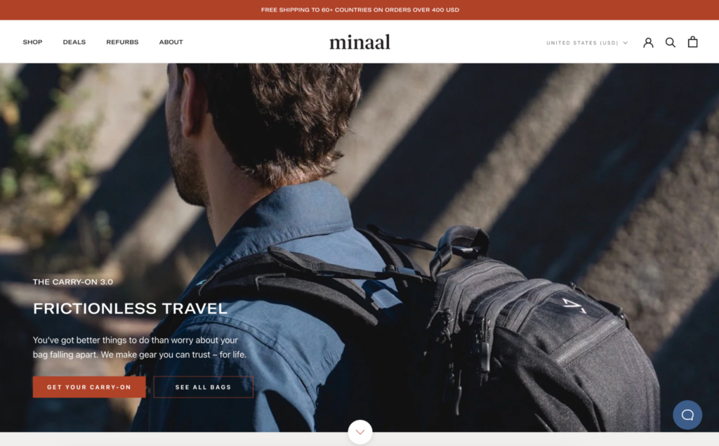
In the example here, Minaal uses a streamlined web experience to allow potential or returning customers to easily find what they’re looking for. The high-quality centered photograph gives a clear and immediate indication of what the company sells and the navigation bar on the left gives four options to click on based on your interests. The buttons on the photograph direct the users to the photographed content, driving customers to the bag in as little as one click.
Why does UX matter in politics? Each click a user has to take to get to a webpage is one more click they have to stay engaged with your content. There is an art to quickly and directly getting voters and donors to the page where they can learn about the candidate and donate. A streamlined web experience can help inform voters about your campaign or cause and get you those crucial donations.
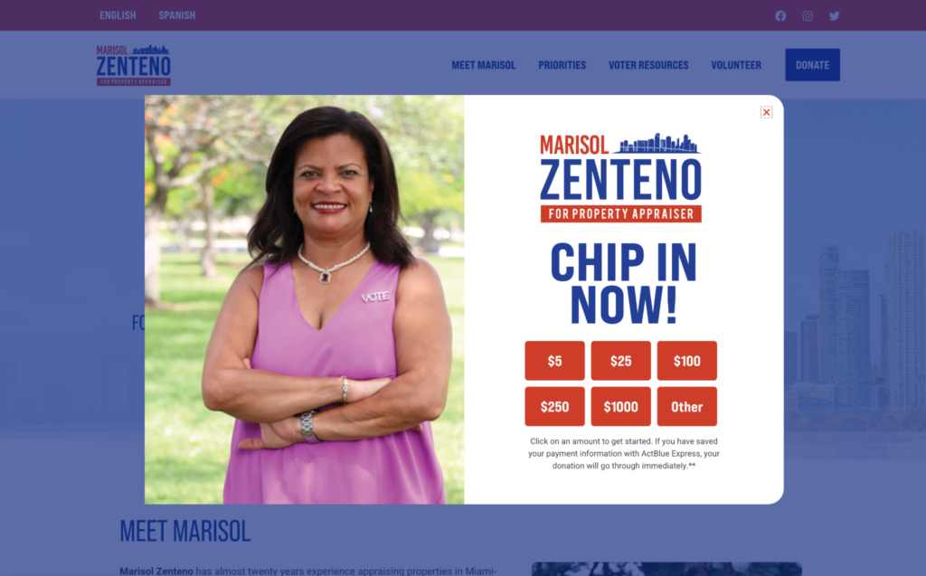
COMPETE’s Digital Designer Andrew Curtis designed this site for Marisol Zenteno. Notice that upon entry to the website you are immediately greeted with a donation pop-up. This directs users’ attention to one of the primary aims: campaign fundraising. From here, the site allows the users to easily learn about the candidate or dive into further details about her position on key priorities.
Ready to learn more about web and UX design? Click here.
Political design can harness powerful corporate design techniques, crafting clean design work and bringing important victories to fruition across the country.
Interested in continuing this conversation? Or wanna talk about kerning? The best font pairings for your branding? How to ease keyframes in After Effects? Reach out to my contact information below!
